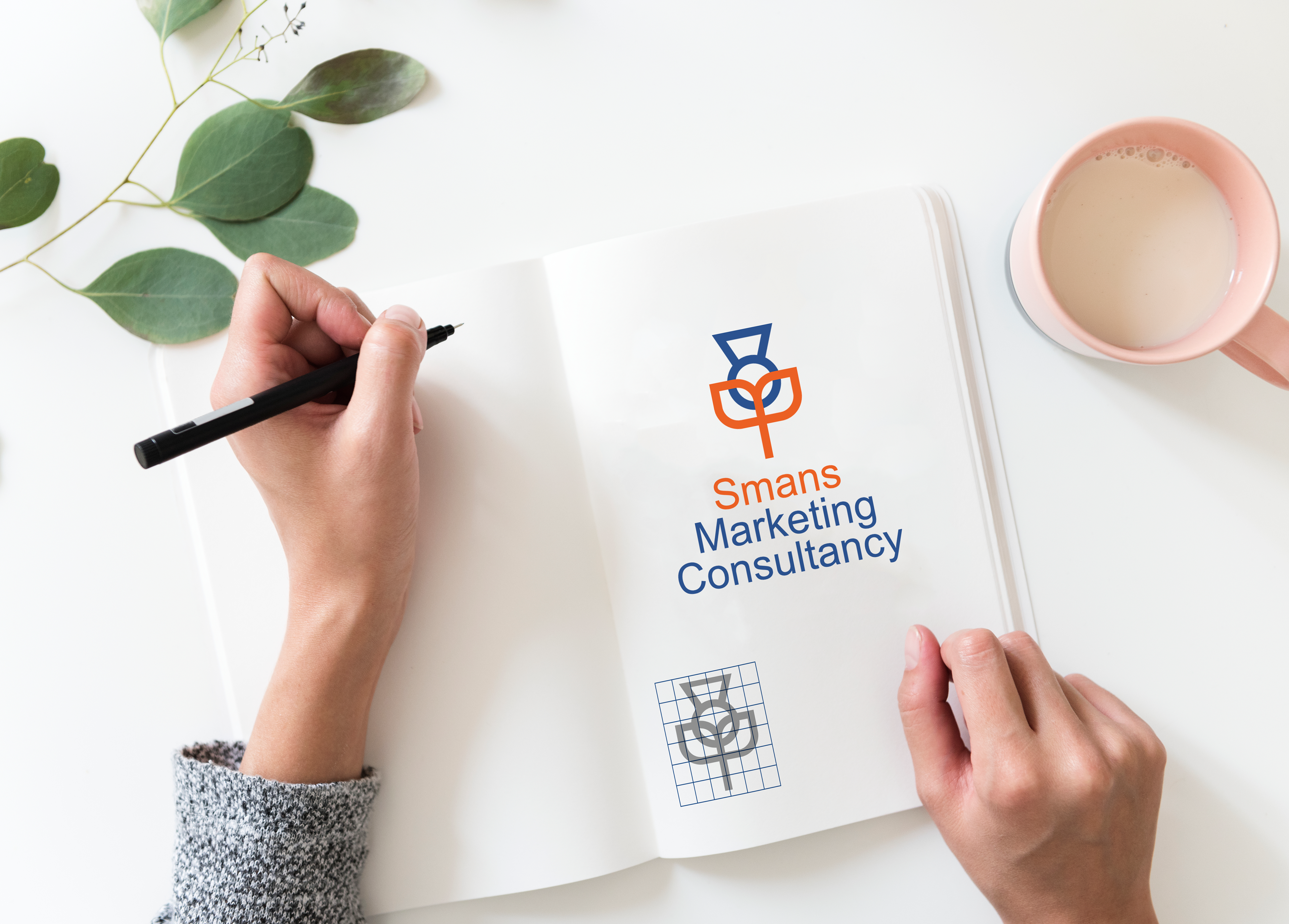
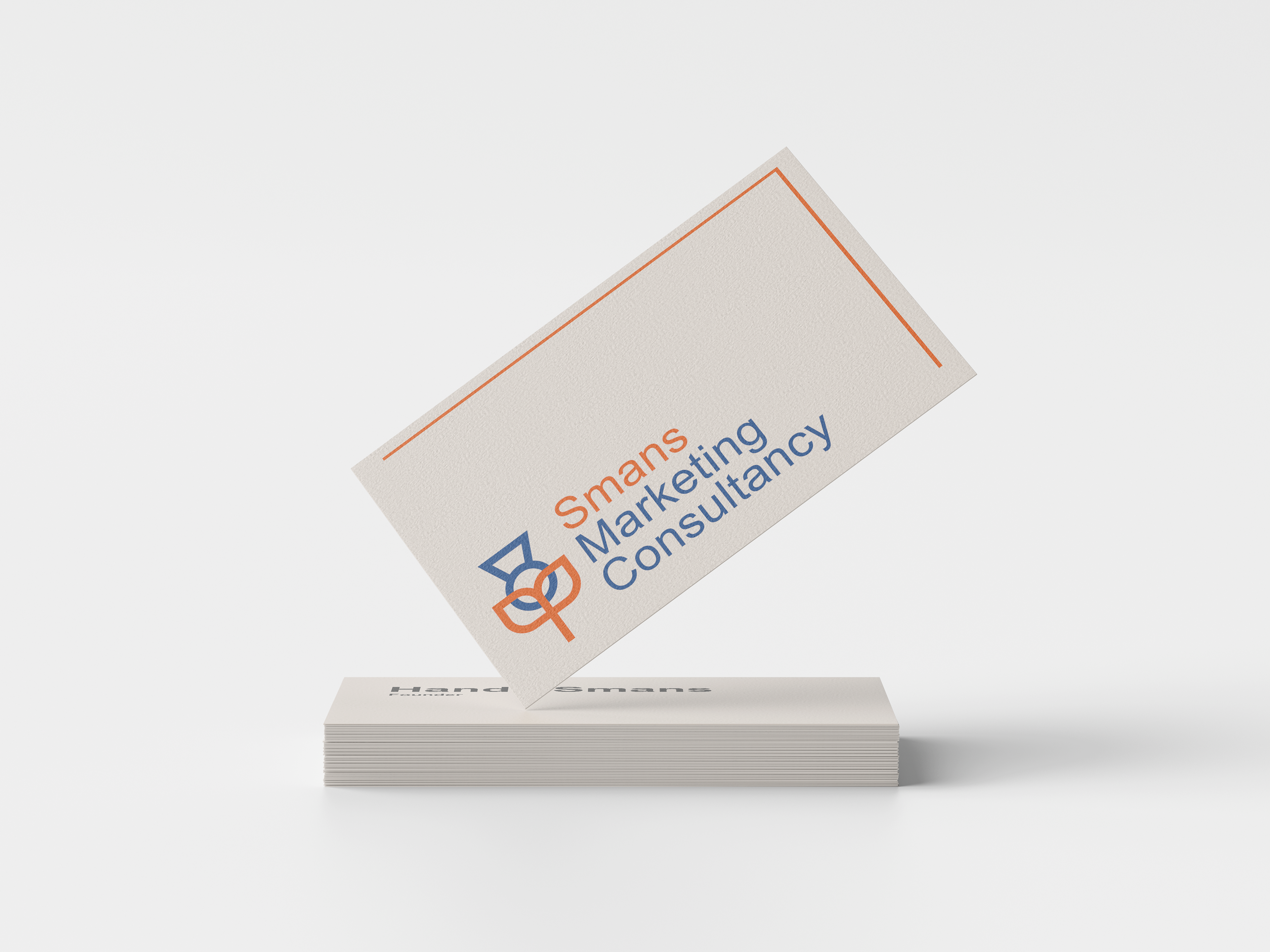
The final logo
Initial idea exploration
Idea development


I was asked to create a minimal and modern logo that represented both a thistle and a tulip for Smans Marketing Consultancy.
The tulip represents Holland and the thistle represents Scotland as the company's founder is from Holland and the company is based in Scotland. The aim of the logo was to bring those two nationalities together in a modern and appealing mark.
This project was quickly achieved in just under a week. The original direction was chosen by presenting the client with a collection of logo designs based on flowers and identifying the elements they liked and those they did not. From here I spent several days combining the two flowers together, considering the negative space they created or their combined silhouettes before choosing the best solutions to present to the client. The preference was towards this logo because of its simplicity and balanced used of negative space.
Date:
May 2020
May 2020
Client:
Smans Marketing Consultancy
Smans Marketing Consultancy
Role:
Designer
Designer
